Creating Compound Widget for Individual Tags

Hi Everyone,

I had a previous post about this but I decided to replace it with this one as the other one was worded really badly.

Lets say I have a compound widget that looks like this:
Capture
And these are the tags I wanted to map. The square indicator turns green if CardX is true, and CardXDesc goes in the IO description.
image
How can I go about creating a compound widget that does this? The tags need to be separate and not under a UDT, because I need them to have individual descriptions as well.

I also need the compound widget to be able to address any card name, not just “CardX”. So if my tags were called Card7_1 and Card7Desc_1, the compound widget would still work. I suspect snippets have something to do here.

I’m also open to alternative suggestions on how to do this, but I’m not sure where to start, I’m inexperienced with XML programming. Thanks guys!

A Compound Widget is a collection of standard widgets prearranged into some configuration. Like any other widget, compound widgets have a collecting properties, some of which can be bound to OpcUa variables. I think that a compound widget makes sense in your case.

Compound widgets (like most things in Automation Studio) are defined using XML. XML uses parent and child tags, where each child can have children of its own. A “tag” is defined such that everything in between the start and the end (which I can’t type here since it gets formatted out) is the information associated with that tag. XML is a pretty commonly used language so while I don’t know of any B&R documentation that thoroughly describes how to use it, there are plenty of resources online that can help you if you want more information.

A compound widget has a handful of availble top-level tags, and there are two that will help you:

  • Widgets - the widgets you want included in your compound widget
  • Property - properties of the compound widget (styling, information to show, etc.)

When you add a compound widget to your project you’ll get a template file that has the XML tags and some comments containing helpful examples.

The first step in creating a compound widget is to define the widgets you want to include within your compound widget. The easiest way to do this is to lay the widgets out within a Content in the graphical editor, and then copy and paste the resulting XML into the Widgets tag as described here.

Then, you have to define the properties of your widget. In your case, you’ll want to define two bindable properties - the color of the box and the text shown in the description. These properties will then link to the bindable properties already available for the widgets within your compound widget.

When you add your custom widget to a Content, it will appear like any other Widget. The Properties tab in Automation Studio will have sections where you can bind a STRING variable (just like you’re using a TextOutput) and another variable for changing the color of the box. The exact variable will depend on how you create the box (rectangle, image list, etc.). You can then bind your distinct OpcUa variables to the properties you created just like you would with any other widget. Since a custom widget gets included in a Widget Library, you can add other assets to the library as you need (e.g. images).

One thing to note - Compound Widgets are just a collection of other widgets collected into one widget. This means that you’re not exactly making something new, rather you’re rolling both widgets into one to avoid copying and pasting the same collection of widgets multiple times. This means that you can only edit properties that exist for the base widgets. For example, when you add a Rectangle to your page, the only bindable properties are Enable, Style, and Visible. In addition there are many non-bindable properties that can be accessed. You can’t modify these base properties because you’re not editing the base code for a rectangle; you’re just using what already exists.

For a completed example, check out this post.. The last message in the thread contains a custom Indicator Light library which has a compound widget consisting of an image list that can show three different images.

1 Like

Hey Marcus,
I’m still confused on how to even change the color of my rectangle. If this was just a regular rectangle widget, I’d normally create an OPCUA event for it that checks the BOOL value of CardX_1, and set widget actions that change the style of that rectangle. With compound widgets however, I can’t even use OPCUA events. When I follow the method explained here and open the .content as text, there are no changes in the text file so that method didn’t work for me. Is there a library with a compound widget that changes the style, that I can reference, or is it possible for us to walk through how to actually create a compound widget that changes the style of a rectangle based off a BOOL?

Edit: I’ve just looked at the image list post. That example is too specific to an image list widget, where as I’m just trying to change the style of a rectangle in a compound widget. I couldn’t really derive any useful info from that widget unfortunately.

Hi JackLin,

If you want to bind a variable to change the style of something within your compound widget, you can define the style as a property.

First, lay your widgets out within a Content. This is what I did:
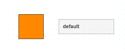
image

Then SAVE your content and close it out. Open it as a text file by right-clicking on it in the Logical View and selecting Open → Open As Text. This will show you the XML definition of the content. The important part is what’s in the Widgets tag:

  <Widgets>
    <Widget xsi:type="widgets.brease.Rectangle" id="Rectangle1" top="260" left="360" zIndex="0" style="Orange_backColor" />
    <Widget xsi:type="widgets.brease.TextOutput" id="TextOutput1" top="280" left="520" width="220" height="60" zIndex="1" style="Output" />
  </Widgets>

Paste this directly into the Widgets tag in your compound widget. This will define your compound widget as the collection of a Rectangle widget and a Text Output widget. You could then build your project and use this new widget as is, but it wouldn’t have any bindable properties. To add those, update the Properties section of the compound widget using the template included when you import a new compound widget:

        <Property xsi:type="BindableProperty" name="TextToShow" type="String" required="false" defaultValue="" readOnly="false">
            <Description>Text which is shown in the TextOutput widget</Description>
            <Mappings>
                <Mapping widget="TextOutput1" property="value" mode="oneWay"/>
            </Mappings>
        </Property>
        
        <Property xsi:type="BindableProperty" name="RectangleStyle" type="String" defaultValue="" readOnly="false" typeRefId="widgets.brease.Rectangle">
            <Description>Style of the Rectangle widget</Description>
            <Mappings>
                <Mapping widget="Rectangle1" property="style" mode="oneWay"/>
            </Mappings>
        </Property>

This code will create two bindable properties which will then show up in the widget’s properties once you add it to a Content. These properties can then be bound to variables:
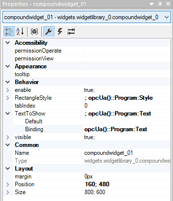
image

Note that when you change a widget’s appearance with a Style, that Style needs to be present in the project and is defined within a Theme. If your theme or style changes, the value you’re sending the widget may need to be updated. For this reason, it may be easier to use an ImageList widget and instead create images of different colored rectangles that you can cycle between (depending of course on the use case).

If you want to change the style using an Eventbinding (i.e. by changing a BOOL in your code), you would instead define the style change as an Action so you don’t need to include the “RectangleStyle” bindable property above (though you may still want the text one). Like a BindableProperty, an Action in a compound widget simply creates an Action for your widget that links to an existing Action for one of the sub-widgets. In this case, you’d want to link to the SetStyle action for a Rectangle widget. You can do this by adding the following code to the Action tag:

        <Action name="ChangeBoxColor">
            <Description>This action will change the color of the box.</Description>
            <Mappings>
                <Mapping widget="Rectangle1" action="SetStyle" />
            </Mappings>
        </Action>

You can then link an event to the ChangeBoxColor action like you would link an event to the SetStyle action of a Rectangle.

This is a quick example I made that sets the color to Blue when my BOOL turns true and sets the color to Orange when the BOOL turns false:

        <EventBinding id="EventBinding_1">
            <Source xsi:type="opcUa.Event" refId="::Program:ChangeStyle" event="ValueChanged" />
            <EventHandler condition="newValue">
                <Action>
                    <Target xsi:type="widgets.widgetlibrary_0.compoundwidget_0.Action" contentRefId="content_0" widgetRefId="compoundwidget_01">
                        <Method xsi:type="widgets.widgetlibrary_0.compoundwidget_0.Action.ChangeBoxColor" value="Blue_backColor" />
                    </Target>
                </Action>
            </EventHandler>
        </EventBinding>
        
        <EventBinding id="EventBinding_2">
            <Source xsi:type="opcUa.Event" refId="::Program:ChangeStyle" event="ValueChanged" />
            <EventHandler condition="NOT newValue">
                <Action>
                    <Target xsi:type="widgets.widgetlibrary_0.compoundwidget_0.Action" contentRefId="content_0" widgetRefId="compoundwidget_01">
                        <Method xsi:type="widgets.widgetlibrary_0.compoundwidget_0.Action.ChangeBoxColor" value="Orange_backColor" />
                    </Target>
                </Action>
            </EventHandler>
        </EventBinding>

You said that you’re having trouble using OpcUa events with compound widgets. I’m not sure why that’s the case. As far as I know there is no such restriction, and I got the above example working with mappView version 5.24. Otherwise, once you’ve created an Action within your compound widget, you should be able to use it as you already have been doing with the Rectangle widget.

Yes my biggest problem was that I couldn’t do OPCUA events in compound widgets. Here’s even my help file telling me that its not possible, with the mapp version being 5.24:


Anyways, I got around this issue by creating a 0 by 0 rectangle in the compound widget, binding its visibility to my BOOL variable, then using its visibility change as a widget event that changes my style, and that method seemed to work. I wanted to avoid it as much as possible but after learning that work-arounds like those were actually common-place in AS programming, I felt a lot better about implementing it.

Anyways, my compound widget works fully now. Still don’t get how you were able to use OPCUA events though :confused:

Never feel bad about workarounds! The caveat we always give with them is that they aren’t guaranteed to work forever and in all cases as they aren’t supported features, but at the end of the day if you get your project working that’s always a good feeling.

I think that we’re talking about two different types of event/action systems. Your screenshot comes from this section of the Automation Studio Help:
image

This section describes how to link the widgets within your compound widget together. You said you created a 0 by 0 rectangle in your widget. You can bind the visibility of that rectangle (or rather the VisibileChanged event) directly to the action of another widget within your compound widget. The event is triggered within your compound widget and the action takes place within your compound widget. In this case no OpcUa bindings are possible, but they also aren’t needed because you aren’t doing anything with PLC variables. The information never needs to leave the widget so to speak.

However, you can also “import” events or “export” actions between the widget and other widgets or process variables using these sections of the Automation Studio Help:
image

If you create a BOOL variable within Automation Studio, and expose that variable over OpcUA, you can use it to trigger actions on your compound widget. Note that this requires you have an external PLC variable available. This is what I did to get my example to work.

I’ve attached my example here in case it helps you. It’s by no means polished but it turns the snippets I posted before into actual code.
TestBinding.zip (156.4 KB)

Hopefully this clears things up. I’m sorry if I lead you down the wrong path due to not completely understanding what you were trying to do, but it sounds like you got something working.

1 Like

Hi Marcus

Of course all events can be handled outside of the compound widget and can be handed over to the widget.
But often, creating one complex-binding and reacting in the widget itself is much easier, especially when providing a WidgetLibrary which should be as easy as possible to use for a developer.

My workaround shows how to react INSIDE the compound-widget on a variable change of a variable inside a complex binding. So every event-action binding inside the compound widget, reduces the effort for a user of the widget in the event-binding files.

Best regards and have a nice day.
Hannes Fisch <°///—< :fish:

Hi @c589717,

It looks like you got some good suggestions from other community members, and it has been a couple of weeks since the last activity on this post. Can you please mark the reply that helped you the most as the solution? Or if you still have open questions on this topic, can you please provide an update?

Jaroslav