when displaying a value with a unit in mappView, there is always a huge gap in between. This is especially disturbing when using smaller font sizes. Like in this case where the value is in 12pt and the unit in 10pt
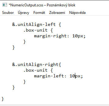
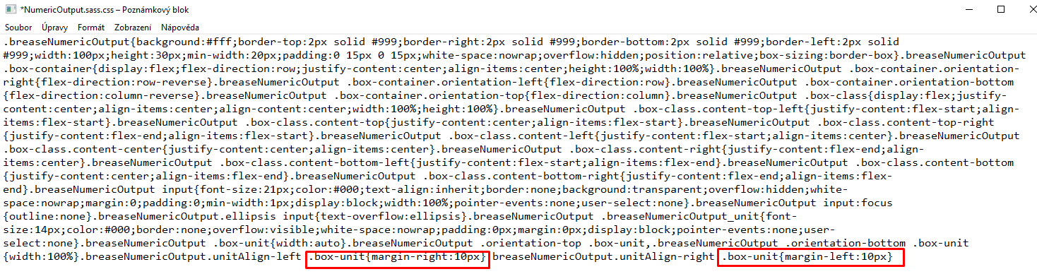
Analyzing this a bit I came across the brease_core.css, that has (in my case for a numeric output) the following settings:
Hi Markus, I checked but also couldn’t find a setting that would allow you to change that padding. I also checked in AS6 and while there are additional styling option for the unit display, padding to the value isn’t one of them .
WDTC might be an option and creating you own custom copy with the modification.
Just for fun I came up with a “simple solution” that could easily be made into a compound widget that can also scale and has the same properties as a regular NumericInput with an additional setting for the unit padding.
The result looks pretty promising but it really is a pretty cumbersome workaround and should be necessary in my opinion.
If you want to take a closer look below is the code from my sample content. If you change the padding for the UnitOnly input you can “move” the unit closer to or further from the value.
thank you for this “simple solution”. With that I can make my visu work!
However, I still consider this either as a missing feature, or even as a bug.
For larger font sizes, the default widgets are fine, but not for smaller ones.