Hello Community,
the following is a quick tutorial how to test different screen aspect ratios, sizes in simulation.
Introduction
When developing mappView visualizations it is sometimes necessary to start developing before actual hardware is available. There are multiple easy to use solution based on Chrome extensions but they only consider the actual screen size not the pixels per inch (PPI) for different displays.
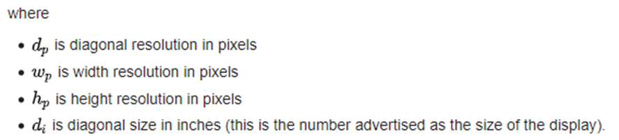
The PPI can be calculated using the Pythagoras and the diagonal screen size:
- Calculate diagonal resolution in pixels

- Calculate the PPI

Solution
When calculating different PPIs for different screen the following results can be used to determine the correct emulator screen size for the used screens PPI.
For example:
| Device | Resolution | Diagonal size | PPI |
|---|---|---|---|
| Dell laptop screen | 1920 x 1080 | 15.6” | 141.22 |
| Display monitor ViewSonic | 1920 x 1080 | 24” | 91.78 |
| B&R panel | 1920 x 1080 | 10.1” | 218 |
| Emulated device on Dell laptop | 1247 x 701 | 10.1” | 141.6 |
In order to create an emulated display close to the correct dimensions of the physical display we can simply calculate the difference of PPI between the two.
Display to be tested PPI / Available Display PPI = PPI ratio
218 / 141.22 = 1.54
Now we can scale the screen resolution to the available PPI.
Available Display Pixel width / PPI ratio
and
Available Display Pixel height / PPI ratio
1920 / 1.54 ≈ 1247
and
1080 / 1.54 ≈ 701
The resulting new display size is 1247 x 701 and still in the correct 16:9 aspect ratio but now scaled to the PPI of the Dell laptop screen.
The resulting window in Chrome is exactly 10.1” on the Dell laptop screen @ 100% zoom (see image below).
Usage
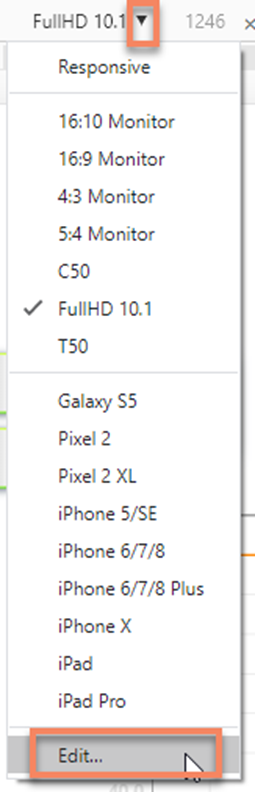
Enabling and adding emulated displays in Chrome is done through the Developer Tools (F12) or a Chrome extension.

Through the device bar Edit it’s now possible to add custom devices.

Even without setting PPI accurate custom devices this is a very helpful function to test visualization for different aspect ratios especially when you trying to develop multiple sizes like discussed here Mapp View multiple display sizes